Sunday, May 24, 2020

Looking at the Numbers Part 2: COVID-19 Cases in the U.S.

A week ago I posted analysis of COVID-19 cases for various countries here.

In this post, I use some of the same methods (Python, pandas, scipy, matplotlib) to look at a dataset for U.S. counties http://usafacts.org.  This data is used to look at growth for states.

TL;DR

  • COVID-19 cases in the U.S. also fit a log-normal distribution
  • Several U.S. states are close (90-95%) to the maximum expected total cases
  • The trend shows that the maximum expected total cases will be about 2% of the population
  • Several populous states have a ways to go

Overview

I focus on the 3 most populous states that I have good curve fits for (NY, NJ, MA) and the 3 most populous states that I don't have good curve fits for (CA, TX, FL).  

For this post, I'm using the log-normal cumulative distribution function (CDF) since the underlying data set was total cases (cumulative cases).

Note that the data used only reported numbers and that it is plausible that the actual number of cases is much higher.

Plots

The plots of NY, NJ and MA include the estimated log-normal CDF curve fit.  The legend includes the estimated total number of cases.  Based on the current total number of cases, the percentage complete is: NY (95%), NJ (89%), MA (89%).

I was not able to fit the CA and TX data.  FL has an estimate, but I don't consider it a reliable fit because it is too early (see my previous post on reliability).


Expected Percentage of the Population to Get COVID-19

Two metrics are compared to determine what percentage of the population will get COVID-19.  
  • Estimated % Complete - calculated by dividing the current number of cases by estimated number of total cases.  The higher the percentage, the more reliable the estimate.
  • % of the Population at Estimated Peak - this is the estimated number of total cases divided by the population.
The chart shows that the trend is towards 2% of the population getting infected.  Only the most reliable estimates were included (where the estimated % complete was greater than 50%).


If we assume that 2% of the population will get reported as having COVID-19, then several states have a long ways to go.

State
 Population 
 Total Cases to Date 
 Estimate Remaining Cases to Reach 2 % 
CA
   39,144,818
                            88,226
                                     694,670
TX
   27,469,114
                            52,268
                                     497,114
FL
   20,271,272
                            48,675
                                     356,750

Saturday, May 9, 2020

Looking at the Numbers: COVID-19 New Cases

[Updates 6/4/2020]

TL;DR

  • A Log-Normal distribution appears to be a surprising good fit to the number of new cases in various countries
  • The log-normal is able to predict the future growth of the virus assuming no later waves
  • It's highly probable that the number of cases are under reported
  • The idea of flattening the curve is can be misleading [Updated 5/18/2020]
  • There are many populous countries that are just starting to "blow" up.

My Goal

We all have our own way of coping with the current pandemic.  For me it was looking at the numbers to see if I could understand where we were heading.  I feel that much of what is presented in the media is dumbed-down for the general population and wasn't answering the questions that I was asking in the way I wanted them answered.

My goal was to find a mathematical function that fit the data that could reveal the potential size of this pandemic.  I looked at the growth for various countries with different strategies.  I also picked countries that were further in the cycle so that the data would be more revealing.
  • South Korea
  • Italy
  • Spain
  • Germany
  • United States
I used Python's pandas, scipy modules, which allowed for quick processing of the data, a rich collection of mathematical functions and as a bonus, a curve fitting algorithm.

Log-Normal Distribution

After several attempts of identifying a function, tracking its fit over days or weeks, I found the best fit was a Log-Normal distribution.  This is the same function I identified in a previous post for fitting income/wealth distributions [1].  In that context, it makes sense that a log-normal fits this pandemic.  At the beginning, there is exponential growth and the entire population is a candidate for infection.  This results in rapid growth at the beginning.  Then, as more people have had it, there are fewer candidates so the tail dies off more slowly.    

Plots

Here are my attempts at fitting a log-normal distribution to the number of new cases for various countries.  The actual data is a solid blue line and the dashed orange line is the log-normal estimation.  The legend for the log-normal shows the estimate for total number of cases, e.g. "3.01M" is 3.01 million. 


Curve Fit Parameters

The curve fit parameters for a log-normal are scale, sigma and offset.  These are useful in the following ways:
  • scale - provides an overall estimate of the number of cases
  • sigma - provides the shape (how wide or narrow)
  • offset - provides the starting date 
Table of fitting parameters for each Country (sorted by start date)
Country  Scale 
(# Cases)
Sigma Offset (Days)
South Korea                  9,100 0.76 55
France              141,500 0.35 57
Italy              246,000 0.55 58
Spain              226,100 0.39 63
Germany              175,700 0.43 63
United Kingdom              530,100 0.82 75
United States          3,010,500 0.88 76

Pythons scipy.stats.lognorm includes the functions pdf (probability distribution function), cdf (cumulative probabilty function), and ppf (percent-point function).  The ppf was used to determine dates for when each country would achieve some level of percent complete.

[Updated 6/4/2020. Add to table below date when actual % was reached.  Green/Yellow/Red indicate how close the prediction was. This shows how hard it is to predict the future since most of the green dates were before the prediction was made]

Table of % Complete (Assuming Log-normal) Predicted on May 9, 2020
Country 50% 67% 95% 99% 99.9% 99.99%
South Korea 3/4/2020
3/2-3/3
3/8/2020
3/5-3/6
3/28/2020
3/19-3/20
4/20/2020
3/23-3/24
6/4/2020
3/24-3/25
8/5/2020
3/24-3/25
France 4/7/2020
4/6-4/7
4/13/2020
4/12-4/13
5/9/2020
5/6-5/7
5/29/2020
5/12-5/13
6/26/2020
5/15-5/16
7/27/2020
5/15-5/16
Italy 4/5/2020
4/4-4/5
4/16/2020
4/15-4/16
6/2/2020
6/3-6/4
7/16/2020 9/28/2020 12/26/2020
Spain 4/4/2020
4/1-4/2
4/10/2020
4/7-4/8
5/4/2020
4/29-4/30
5/23/2020
5/8-5/9
6/20/2020
5/9-5/10
7/21/2020
5/9-5/10
Germany 4/5/2020
4/4-4/5
4/12/2020
4/11-4/12
5/10/2020
5/7-5/8
6/2/2020
5/16-5/17
7/8/2020
5/19-5/20
8/17/2020
5/19-5/20
United Kingdom 5/23/2020
5/26-5/27
6/22/2020 12/6/2020 6/23/2021 8/3/2022 3/13/2024
United States 5/19/2020
5/18-5/19
6/19/2020 12/18/2020 8/6/2021 12/9/2022 12/21/2024

Under Reporting

I personally know many people that have claimed to have COVID-like symptoms but were never even tested.  The curve fitting model presented above supports those claims, since the "Scale" or estimated total number of cases is far below each countries populations.  The highest percentage of estimated cases is United States at around 1%.  The remaining 99% are a mix of "not yet infected", "immune" and "infected and not reported".  Since the uninfected are susceptible to getting infected, this should result in a potential resurgence.  In the case of South Korea and Germany where stricter containment was used, the uninfected is probably a larger portion of the population.   

Table of Population and Estimated Percentage Infected
Country Population % Infected
South Korea 51M 0.02%
France 67.0M 0.21%
Germany 83.1M 0.22%
Italy 60.6M 0.41%
Spain 46.7M 0.48%
United Kingdom 67.1M 0.79%
United States 328.2M 0.92%


Flattening the Curve

There is a lot of talk about "Flattening the Curve".  This is the idea that by taking measures, we don't decrease the total number of cases, just spread it out over time.  This is misleading on various fronts.

Logarithmic Scale

Many sources plot the data with the number of cases on a logarithmic scale.  Below are plots of the CDF (Cumulative Distribution Function) with fitted data.  The first plot is a linear scale.  While the rate of growth is slowing, it still has a way to climb.  
 The second plot is using a logarithmic scale. It appears the curve is flattening, but this is the same data.  It's only flattening because tick marks at the top represent much large jumps, flattening the curve.

Spreading the Curve

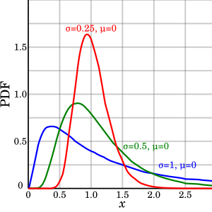
[Updated 5/18/2020.  Scale is one of the fit parameters and varies by country.  It may be possible that scale can be changed by a countries response] Another idea is that by flattening, we are spreading the data over time.  For the log-normal, this would mean varying sigma, since scale and offset are assumed fixed.  While a larger sigma lowers the peak, it also pushes the rise further left.  This doesn't agree with the "flattening the curve" concept.  Lowering the peak should push the peak right, not left.

Plot of the Lognormal PDF
If you looked at the sigma for each country and estimated percentage infected, there is no real correlation.  The only thing that makes sense is that extreme intervention lowers the number of cases.  Countries like South Korea and Germany had the most extreme intervention (0.02% and 0.22%  infected) and the US with a relatively poor response has the highest (0.92%)
[Updated 5/18/2020 with Scale]  It appears scale is correlated to the total number infected, so flattening the curve may be possible.

Country Sigma Scale % Infected
South Korea 0.76 9.6 0.02%
France 0.35 41 0.21%
Italy 0.55 40 0.41%
Spain 0.39 30 0.48%
Germany 0.43 33 0.22%
United Kingdom 0.82 60 0.79%
United States 0.88 65 0.92%

Reliability of Prediction

The reliability of predictions was evaluated by seeing if a past prediction matches the current numbers.  For example, "dt-10", would be a prediction made based on the only data available 10 days ago.  This shows that attempting to predict with insufficient data effects the estimation (for example, Russia and Brazil and still rising so their predictions are not reliable).  The esimated number of total cases for Italy has been stable for the last 2 weeks (since it is further in the cycle) and has been steadily climbing for the US (since the US is just passing it's peak)

Other Countries

The pandemic is just starting in many of the world's most populous countries: India, Russia, Brazil, Mexico, Indonesia, Bangledesh, Pakistan, Nigeria.  Many of these countries are less prepared than the rich European countries that are already passing their peaks.  It's too early to tell how this will play out worldwide.

Data Used: https://covid.ourworldindata.org/data/owid-covid-data.csv


Prosperity vs. Inequality

Much attention is given to the inequality in income and wealth.  Calls to "tax the rich" and raise the minimum wage are efforts to reduce this inequality and appeal to the moral concept of "fairness".  However, a more careful look at the data begs for an alternate focus.  The goal should not be equality but instead the goal should be to lift people out of poverty.

My hypothesis is that general prosperity is the way to overcome poverty.  By general prosperity, I mean a system of organizations, traditions, processes, laws, behaviors that promotes prosperity.  Prosperity is therefore the correct measure.

I. Common Sense Reasoning 

You have a choice of living in one of two society:

  1. A very equal society where the gap between the top and bottom of wages is small
  2. A very prosperous society where even the bottom wage earners have all of the basic necessities.
Here is another condition of these two societies:
  1. In the equal society, the bottom 50% do not have the basic necessities.
  2. In the prosperous society, the top 1% have 90% of the wealth.
The rational choice is the prosperous society.  The problems in the equal society are real resulting in a lack of absolute wealth while in the prosperous society it is more a matter of perception resulting from comparison to the ultra wealthy.  

In the next sections, I attempt to prove that this is not just a thought experiment but a reality.

II. Income Distribution

In a previous post [1], I describe the shape of the income distribution for United States.  It turns out that this shape applies to other countries.  (Note: there are better models for fitting the data [2] but I will stick with the simplicity of my original model).


The original model of income distribution has been simplified to two parameters: "scale" and "shape".

Fitting Parameters for Income Distribution
ParameterImpact on EqualityImpact on Prosperity
ShapeLower values improve equalityLower values reduce poverty.
ScaleLarger values widen the absolute gap,
but relative wage gap remains the same
Larger values increase prosperity

In order to decrease poverty, both the shape and scale parameters need to increase.

The following table shows the parameters for the United States and China.

Fitting Parameters for US and China
Country Shape         Scale      Gini Coefficient
United States
1.0
61,160
~0.4
Australia 0.6
52,776
~0.3
China
0.6
1,920
7,863
~0.4

Note: The China data was bi-modal (two peaks) which implies an overlay of two functions.

While the "Equality" parameter for China (0.6) results in greater equality than the U.S. (1.0), it is the larger "Prosperity" parameter for the U.S. (61,160) that results in fewer people in poverty than in China (1,920 and 7,863).

The data used with fitted log-normal distribution are shown in the next figures.


III. Additional research


Similar results have been published by Max Roxer and associates at ourworldindata.org.  For example, the article "Incomes across the Distribution" [3] includes findings from this research that support my hypothesis:
Australia has also seen an increase in inequality, but ... the incomes of all households increased substantially. This contrast is a good example that makes clear that we cannot rely on aggregate measures – like mean GDP growth and inequality measures – alone. We have to study incomes across the entire distribution to be able to see what is happening.
A last example makes clear that we should not focus on economic inequality alone: Greece has seen substantial reductions in inequality, yet the fall in incomes outweighs this development.

In "Income Inequality" [4], Global income inequality is plotted at three different times showing that the world has transitioned from most in poverty, to  divided by rich and poor, and finally to a richer, more equal world.


References:

[1] http://wrauny.blogspot.com/2013/02/why-are-people-poor-and-what-can-we-do.html
[2] Income Distribution in the United States, A Quantitative Study. http://www.roperld.com/economics/IncomeDistribution.htm
[3] Income across the Distribution, https://ourworldindata.org/incomes-across-the-distribution/
[4] Income Inequality https://ourworldindata.org/income-inequality/

Thursday, April 2, 2020

Accepting a Pandemic Mindset

On March 11, 2019, I texted a friend regarding COV-19
 "I think it's overblown and will be mostly over in a month,
  but I've been wrong before trying to predict the future."
On March 12, 2019, I texted the same friend with a link to a news story where the governor of California, Gavin Newsom tells people to cancel, postpone events of more than 250 people.
"I never thought I'd be proven wrong so quickly" 
Soon I was working from home, and plotting the daily growth in cases.  At first the data was upsetting when I projected the exponential growth forward. Last week I expected 1 million cases by this week and today my prediction proved accurate.  I expect 1 million deaths by the end of the month.  Although upsetting, I have had to adopt a pandemic mindset.

This is hard due to the concept "regression towards the mean" that has us conditioned to expect things to eventually improve.  A down market recovers.  Bad weather passes. I basically have seen this "regression" mindset pervade until something clicks and the person adopts the pandemic mindset.
I give everyone a pass that has been or still hasn't yet adopted the pandemic mindset.
We all refuse to accept it at first.  Everyone has their reason for waiting.  But the pandemic will continue to grow exponentially until it can't be denied or ignored.  It will continue for weeks, months, maybe years.  Eventually, we WILL have "regression towards the mean" where things return to normal.  It may be one year or many.  Most likely it will be longer than we expect due to our biases.

Meanwhile, I'm thankful that our governor, president and much of the public have adopted the pandemic mindset.  I'm watching Brazil carefully because their president still hasn't adopted the mindset.

Coping with a Pandemic Mindset

How do you cope after adopting the pandemic mindset?  For me, I'm learning about secular Buddhism.  There is suffering in the world.  One cause of suffering is us trying to avoid suffering.  We can end the suffering.  I can't concern myself with worldwide suffering.  Even more, I need to be aware of any suffering I am causing myself by my thoughts.  Recently I learned about meditation using the method R.A.I.N (Recognize, Accept, Investigate, Non-identify). This is how it works.  You sit quietly and try to quiet your mind.  When a thought, emotion, feeling distracts you, you recognize it.  Then you accept that you are experiencing it and don't try to fight it.  Then you investigate. What part of your body is experiencing it?  What part of your body released the hormones to drive the emotion? What experience triggered the response? Are your thoughts accurate? Finally, you realize that these things are external to you and not you.  Your adrenal gland secreting adrenaline was not commanded by you.  The external triggers weren't requested by you.  Don't identify with it. 
If we take the time to look at how we see things, then the way we see things changes
I can't control the pandemic.  I can only control my thoughts and actions: how I spend my time, how I treat those around me, how I communicate with others.  And I can do it in a way that reduces suffering for anyone or thing in my realm of influence.

I believe that this is an opportunity for our culture to evolve in positive ways.   

Friday, March 6, 2020

The Battle for Sleep: The Parable of the Awake and Sleep Warriors

Recently I realized that I've been sleep deprived for most of my life.  "Get 8 hours of sleep" is just another piece of sound advice that I've ignored.  After listening to a podcast[1], I was convinced I could no longer avoid this advice. I resolved to turn off all screens an hour before I wanted to be asleep and to make sure that I had enough time to sleep.  Though I saw benefits, I found my heart pounding and my mind racing as I tried to sleep.  Meditation, yoga, lights off, writing in a journal helped some, but not enough.  I finally came up with this parable to help.

We all have two types of warriors: awake warriors and asleep warriors.  The awake warriors are ambitious and courageous.  They help us face the obstacles of the day.  The sleep warriors help us to rejuvenate at night.  My problem is that the awake warriors dominate.  The awake warriors have been given the best weapons and fastest horses to help extend my day so that I could have more fun, succeed in school, and help care for small children.  As a result, they have received my praise and support.  I throw parades in their honor.

Meanwhile, the sleep warriors have been defeated.  I have taken away their weapons and horses, ignored their pleas.  As a result, I wake up every morning exhausted and unready for the day.  

The awake warriors dominate, so they keep me awake to waste time on screens: binge watching shows, playing mindless games.  There is no longer a meaningful purpose.  They just do it because they are used to it.

But that is the past.

This last week I called all warriors to a counsel.  

I told the awake warriors that I am taking away all of their weapons and fast horses and giving them to the sleep warriors. I told the awake warriors that if they didn't yield to the sleep warriors, that I would cut out their tongues, gouge out their eyes, cut off their hands.  I told them that I appreciated what they had done for me in the past, but that their glory days were over.

I told the sleep warriors to rise up, take courage.  That I would provide every resource to them.  That they were my new favored warriors.  That I would defend them, give them the best weapons and fastest horses.

That night, The sleep warriors helped me have the most restful sleep in a long time.

Then I realized that I was too harsh to the awake warriors.  I realized that I still needed them.  I needed them to give me courage during the day.  To remind me of my responsibilities during the day.  To drive me during the day.  Instead of a battle at bedtime, I decided it would be a changing of the guards.  It was time to call all warriors to counsel.  Give the awake warriors a final say for the day, but them hand guard over to the sleep warriors.  The awake warriors could rest knowing that I would give them full attention in the morning and throughout the next day. The sleep warriors felt respected as they were honored to receive full charge over me with out a battle.  They would have energy to help rejuvenate my body while I slept.

I now have more hope for the future since instead of spending energy on battling, it will be replaced with collaboration.


Resources:
[1] https://www.successpodcast.com/show-notes/2018/1/3/everything-you-know-about-sleep-is-wrong-with-dr-matthew-walker
 [2] Thanks to Adam from http://move-aware.com for being my mentor while I worked through his APART worksheet.

Thursday, July 25, 2019

My Experiment with the Personalized Diet

TL/DR; 
I tested my blood glucose levels every 30 minutes for 2 hours after eating. My personal results:  
  • Bad: grains (wheat, corn, rice, oats) and desserts cause my blood glucose to spike.
  • Good: animal protein (meat and eggs), vegetables, fruit, potatoes, seeds, nuts are best for my blood sugar.    
  • Walking for 15-20 minutes after eating any food restores blood glucose to normal levels
  • I lost 2" of belly fat in 2 month after doing this experiment, mostly from walking after every meal that I know causes a blood sugar spike (probably small diet change as well). 
  • There are other factors than just food that affect blood glucose levels (stress?)
I've been unsuccessfully trying to lower my blood sugar ever since I was told that I have prediabetes.  Even if you don't have prediabetes, elevated blood sugar after eating may cause weight gain and contribute to a host of metabolic diseases.

I came across the research of Dr. Eran Segal and Dr. Eran Elinav from the Weissman Institute in Israel regarding blood glucose response after eating.  The surprising results of their study is that the perfect diet is different for each of us, which makes perfect sense to me.

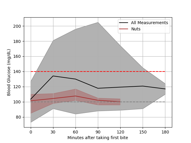
In this post I'll share the results of an experiment on myself to try and determine my personalized diet.  The approach is to take blood glucose measurements every 30 minutes from when you take your first bite of food.  I used the Care Touch glucose monitor as it had the cheapest cost combined for monitor and test strips (I've taken hundreds of measurements).  All of the plots below include an average measurement over 2 hours (dark line) with maximum and minimum measurements included as shaded regions.  The first plot is for all measurements and the following plots have an overlay of specific meal categories (including or excluding macronutrients or food groups).

I'll describe the first plot in detail to help get you oriented.  The vertical axis is blood glucose level.  The bottom axis is "Minutes after taking the first bite".  Before I started eating, I would take a measurement, that is represented as "0 minutes".  The average reading is a dark line.  The minimum and maximum levels create a shaded region.  All measurements fall somewhere in the shaded region.  All other plots overlay a similar plot on this first plot.  I'll put the plots in a progression of how I have tried to manage my blood sugar levels. Every plot has a dashed gray line at 100 mg/dL, since this is an expected level between meals.  The dashed red line at 140 mg/dL is a recommend upper limit.  You can see that I regularly exceed this limit.

The next plot is of desserts (ice cream, donuts, toaster strudels).  Occasionally I go on a "sweet fast", which is a logical thing to do looking at the higher average and overall levels. By eliminating these treats, I expected it would help lower my levels.
The next plot shows the result of excluding sweets.  This includes levels for all meals that didn't include sugar.  Surprisingly it turns out there are plenty of other meals that still cause a rise in levels.
 Before we figure out what is bad, let's find out what is good, or what foods do not cause a rise in blood glucose above the dashed red line.  My body does very well with nuts, seeds, salads and animal (e.g. eggs and bacon)

The salads all included dressing (mostly ranch dressing).  They also include romaine lettuce, spinach,  mixed greens,  tomatoes,  broccoli,  brussel sprouts,  bell peppers,  red onion,  chicken,  eggs,  carrots,  cucumber, artichoke hearts.  The salad that gave the maximum values also had sunflower seeds,  pepitas (pumpkin seeds), corn, peas and croutons.  The effect of seeds can be seen in the previous plot.

The "animal" meals were meals of only food from animals (e.g. bacon and eggs).  As expected these high protein, no carb meals had no impact on blood sugar.  It's important to note that blood glucose level is only one measure of health.  I'm sure that eating only bacon and eggs wouldn't be considered healthy.

 Meals with protein from animals and any assortment of plants (vegetables, fruit, nuts, seeds, potatoes) were good.  I've known that for a while since I always feel great after these meals.  The exception (excluded here) was pot roast with gravy.
 The following were a couple of unexpected results.  Fruit cause a rise in levels the first 30 minutes and then a drop below the initial levels after 60 to 90 minutes.  For this reason, I put fruit in the good category.
Regardless of what I ate, I made a valuable discovery.  GO FOR A WALK AFTER EATING.  If I exercised lightly after eating (take a walk for 15 or more minutes), I could keep my levels below 140 and my levels would even drop to normal.  Below is a plot for foods for which I measured my levels without exercising and then with exercising.  These include: pot roast, Mexican food, oatmeal, donuts, vegetable lasagna, s'mores.  Note that the time of exercise varied

One of the recommended foods for Type II diabetes is oatmeal.  I try to be healthy with my oatmeal so I eat it with raisins and almonds (no milk, sugar, or other sweetener).   The drop at 90-120 minutes is good but the initial spike was unexpected.  I ended up testing each ingredient separately.  Oatmeal was the prime culprit, raising my levels by around 30 for an hour (I ran out of strips).  The almonds reduced my levels over 90 minutes.  The raisins raised levels only slightly and only at 30 minutes.  
Here are some other results.

Mexican food is worse than average.  An exception was Chipotle's salad bowl (chicken, veggies, brown rice, pico de gaio, sour cream), though I only had one data point (a level of 111 after 30 minutes).


In an attempt to minimize dependencies, I had my wife make whole wheat bread.  She ground kernels of wheat into flour and made bread with water, salt, oil and yeast.  I then ate one slice of bread first thing in the morning with nothing else.  I was surprised at how much my blood glucose levels varied at 30 minutes (112 to 167).  My conclusion is that there is another factor affecting blood glucose besides "what you eat".  For example, the stress hormone cortisol elevates blood sugar and possibly that is the cause of this variation.  


Tuesday, May 7, 2019

The Benevolent Atheist

I saw this on the /r/Atheism subreddit
If an Atheist is a good person, will they go to heaven or hell? If hell, then I don't believe in a God that punishes good people for eternity.  If heaven, then what's the point of believing in God?
Another way to ask this would be:
What gets a person into heaven, being good or believing in God?

Of course, the original poster wasn't interested in this answer.  It was really a use of logical fallacy to justify being an atheist.  Still, both questions are pointless since atheist don't believe in an afterlife.  For a meaningful debate, it's important to frame a question within bounds of shared beliefs and assumptions.  For example, both atheist and theist should agree to these points:
  • There is some universal measure of being good (kindness, do no harm, show respect, etc.)
  • The world is a better place if people are good
  • We are born into this world
  • While we are alive, we behave with some level of goodness
  • After we die, we cannot measurably act on this world or the people in it

So our new question with shared understanding is:
What is more likely to influence a person to be good while alive, being an atheist or believing in God?

There may be the standout "benevolent atheist" or "wicked theist", but what about a million people? Would they collectively be more benevolent as atheists or theists?

That is a worthwhile debate. 

An interesting post on the same subreddit