Imagine a book where every page represents the state of the universe at a different point in time. The first page is the beginning of time. The last page is the end of time. You thumb through the book and notice the continual changes from page to page. The formation of stars, planets, life. These pages are a record of all history. As you thumb through the book, you discover the remainder of the book is completely blank. This is the future. Nothing is printed because it hasn't happened yet.
You turn to the last page with printing on it. This is the present. On this page is everything happening in the entire universe at this very moment. The spiraling of galaxies. The motion of the planets. The moon, satellites, international space station and space junk all orbiting the earth. Meteors are striking the atmosphere and burning up into dust. Airplanes are flying through the sky. Clouds floating and changing shape. Rain falls somewhere and it is snowing elsewhere. Birds are flying and singing. The wind blows. People going about their business: driving, eating, sleeping, crying, laughing, arguing. Billions of people. Animals roaming the earth, climbing trees, digging holes. Trees and plants sway in the wind and reach for the sun. Fruit ripens. Fish are swimming in the water. Boats ride on the oceans, rivers and lakes.
Your awareness of the present is like a small period on the page of the present. A little dot. There is infinitely more that you don't know about the present than what you do know. You could spend every minute of the day reading the news and social media and your knowing is still a dot.
You turn to the previous page and there is your little dot at an earlier time. Maybe seconds ago. Maybe minutes, hours or days. There is a trajectory of dots all the way back to your birth. You realize that there is nothing you can do to change your past trajectory. It is permanently recorded in the book of everything.
When you meet someone in the present, it is a rare moment when your trajectories intersect. Even if it is someone you see everyday, their trajectory is more unique than their DNA or fingerprint. Their path is so different than yours that your only choice is to be curious, interested, non-judging.
You turn to the page after the present and it is completely blank. It's the future. It hasn't happened yet. You have no knowledge of what it brings. No amount of thinking can make your dot appear on that page, let along anything else. The printing will only appear when the page becomes the present.
You realize that the only thing that you have any influence over is your tiny dot on the present page. What you think. What you say. How you act. How you breath. That's what you control. But only in the present. And only in the present that you are currently experiencing. You let go of the past. You forget about the future. You focus on the now. You feel your heart open up to the present. Everything becomes more alive. Colors are more vibrant. Sounds are clearer. Food tastes better. People are more fascinating. Your feelings are more clear.
You realize that the goal isn't to change the world; it's to experience the world.
You realize that the goal isn't to feel good; instead it's to be good at feeling.

Monday, July 27, 2020
Tuesday, June 9, 2020
Parable: A Peaceful Walk in the Park
The Story
You decide to go for a walk in your favorite park. There are large canopy shade trees along a lazy stream. Wild flowers line the trail. Song birds fill the air. As you quietly stroll, you feel the weight of the world melt away and a peace and serenity engulfs you.Then you hear a sound.
"help" someone seems to be calling out.
You pause.
Listen.
Nothing.
Then continue your walk, immersing yourself in the quiet and beauty.
"Help!"
You hear it again, but this time it is louder. You detect where it is coming from and turn to the voice.
"BE QUIET!!!" You yell.
Then you turn and return on your stroll.
"Please, Help! Help!"
Once again you turn to the voice.
"I"M TRYING TO HAVE A PEACEFUL WALK. CAN YOU PLEASE STOP YELLING" You yell back.
Then you start walking again.
"PLEASE, OH PLEASE, HELP!!! HELP!!! HELP!!!" The voice is much louder and urgent.
You turn to the voice and yell
"EVERYTHING IS GOING TO BE JUST FINE. JUST RELAX."
The Moral
What is your reaction to this story? Could you identify at all with the "you"? The person crying for help could be a stranger, a friend, a loved one, or even yourself. The cry for help symbolizes any strong emotion: fear, anger, sadness, joy, surprise. We try to ignore, avoid or stifle strong emotions because they push us out of our comfort zones. We justify ignoring the emotional outburst by blaming the person. If they had only been more careful. If they just saw things more clearly.Maybe they deserve to feel that way. But while the emotion is being expressed, the least we can do is acknowledge that the emotion exists. "Wow, I can tell you are really sad/upset/angry! Help me to understand why". You don't necessarily need to take on the emotion or feel it yourself. But you can learn from it.
Last week my dog died. He was 11 years old. I knew this day would come and to be honest, I've been ready to have a dog free house for a while. Yet the day he died I felt a strong grief and loss. I didn't want to. But I did. So I stopped and let myself feel it. Grief is a wake up call to help us realize how many strong bonds we have with those around us, that now is the time to make the most of our relationships.
Investigating someone else's (or your own) emotions is sure to bring greater understanding.
Sunday, May 31, 2020
Looking at the Numbers Part 3: Insight into the COV-19 Pandemic using a simulation
This is the third in the series of analyzing the growth of cases for the current pandemic. In my previous posts here and here, I showed how many countries and states resemble a log-normal distribution. In this post I describe a model that I developed for the pandemic.
TL;DR
Below is an animation of a scale-free network of 1,000 nodes (I used a software tool call Gephi to plot the graph). Uninfected nodes are gray, infected nodes are red. The animation loops. You can see how it starts slowly, then as it hits hubs (nodes with many connections) it speeds up. It slows again as it infects loosely connected outliers.


TL;DR
- I verified my hypothesis that the pandemic can be modeled as a scale-free network starting at patient zero and nearest neighbors being infected each cycle.
- Luck plays a role: where the infection starts in the pandemic makes a big difference in how fast it spreads.
- Re-opening will most likely result in a rise of cases.
Scale-Free Networks
I first learned about scale-free networks from the book Linked by Albert-László Barabási. A scale-free network starts with two nodes connected together. One node is added at a time, preferentially connected to nodes with more connections. These networks describe the topology (organization) of networks as varied as the Internet and the proteins in our cells. It also describes social networks and how disease spread.
I decided to see if by using a scale-free network, I could demonstrate the same log-normal pattern of COVID-19 case growth over time (as observed in my earlier posts). I found a Python module, networkx, that has a function, not surprisingly called "barabasi_albert_graph", that can construct the network. A "graph" is a mathematical term for networks.
City-County-State-Country-World
A scale-free network can describe the social connections in your city. Some people have friends and family in other cities so that a county also resembles a scale-free network. Similarly, counties are connected to form states; states are connected to form countries; and countries are connected to represent the worlds population.
The Scale-Free Network Pandemic Model
Using the scale-free graph, I created a model that I could use to simulate the spread of the disease. Starting with one person, the disease is spread to nearest neighbors, who spread to their nearest neighbors, etc. The model includes policies to reduce the spread (using probability of an infection and limiting "group-size"). For a person with a large personal network, this can radically slow down or "flatten" the curve.Below is an animation of a scale-free network of 1,000 nodes (I used a software tool call Gephi to plot the graph). Uninfected nodes are gray, infected nodes are red. The animation loops. You can see how it starts slowly, then as it hits hubs (nodes with many connections) it speeds up. It slows again as it infects loosely connected outliers.

A Scale-Free Network results in a Log-Normal Distribution
When I ran my model with 2.5 million nodes, it fit very well a log-normal distribution. In the plot below, the orange "Fit" curve is the Log-Normal and it almost covers the blue "Total Cases" generated from the simulation. I also ran the simulation in "flattened" mode with a group-size of 5 (simulating households of 5 people under stay-at-home orders).


Q: What Exactly Does the Network Represent? A: Only Infected People
My initial thinking was that I would produce a graph with 7.7 billion nodes, and experiment with it. Unfortunately my computer isn't powerful enough (It started complaining when I ran more than a couple million nodes). What I realized is that if you consider the complete graph of a population, and then only infected around 2% of the nodes, the infected nodes also resemble a scale-free graph. So I found it most useful to consider the graph as only the people that got infected in a large network.
Luck and Patient Zero
When the current pandemic started, I naturally asked "why is this happening?" and "how can I protect myself?". I started using coping mechanisms. "It mostly kills people with preexisting conditions, so I'll be fine". When Italy was one of the first countries to get hit the hardest, I blamed their culture thinking "It's all of the kissing and hugging Italians do".
With this simulation that produces results similar to real world data, I could play around with it. My first goal was to see if I could find a relationship between the log-normal parameters and the simulation parameters. I varied network size, probability of infection, group-size limits. The resulting fitted log-normal parameters (sigma, scale and offset) showed no correlation.
I then decided to examine the effect of different patient zeros (the person from which the disease originated). I re-ran the model with 10 randomly selected starting nodes for a network of 500,000. In the plot below, you can see that the starting node does make a difference.

I then decided that 10 nodes was too small a sample, so I decided to run for 500 randomly selected starting nodes. Each simulation was run until half of the network was infected. Below is a histogram showing the distribution of these 500 runs. I also wanted to see the dependence on size of the network, so I ran for networks with 1,000, 10k, 20k, 50k, 100k and 500k nodes.

Making Sense of the Variation
This last graph showed that for a network of size of 500k, the disease would most likely take 3-14 weeks to infect half of the population; but it could also take up to 66 weeks! How could this be?
Let's consider two people from Wuhan, China that have been infected:
- A rich businessman goes to the Alps on a Ski trip
- A grandma goes to visit her family in a small town outside of China.
Case 1: Rich Businessman goes skiing
The rich businessman is in the ski lodge with some wealthy Italian young men. They get infected and go back to Italy. They are very socially active (hubs) and infect hundreds of people at a club they go to. Those people are also active and spread to their networks. In a matter of weeks, thousands of people are infected.
Case 2: Grandma visits her grand-kids
Grandma stays with her daughter in a small town. Her only interaction is with their family, husband, wife, and 2 kids. The husband works from home and the daughter takes care of the kids. Once a month, they have dinner with some friends. They infect their friends, who are also socially isolated. Slowly the disease makes its way to a hub, where it spreads more rapidly. It takes months to infect 100 people.
Re-opening
I tried simulating what would happen if the stay-at-home orders were removed, by removing the group-size limit part way through the simulation. The reality is that the rise in cases will probably not be as dramatic since over-all the population has changed it's behavior (wearing masks, washing hands, etc.)

Conclusion
As public policies change in how we respond to the current pandemic, I knew I needed a model where I could simulate changes over time. The scale-free network has proved to be an interesting model to experiment with as it fits the early log-normal distributions of cases over time. The model reveals that there are some things out of our control (who patient zero is), while there are other things we can do to make a big difference (avoid infections via hubs).
Sunday, May 24, 2020
Looking at the Numbers Part 2: COVID-19 Cases in the U.S.
A week ago I posted analysis of COVID-19 cases for various countries here.
In this post, I use some of the same methods (Python, pandas, scipy, matplotlib) to look at a dataset for U.S. counties http://usafacts.org. This data is used to look at growth for states.
TL;DR


In this post, I use some of the same methods (Python, pandas, scipy, matplotlib) to look at a dataset for U.S. counties http://usafacts.org. This data is used to look at growth for states.
TL;DR
- COVID-19 cases in the U.S. also fit a log-normal distribution
- Several U.S. states are close (90-95%) to the maximum expected total cases
- The trend shows that the maximum expected total cases will be about 2% of the population
- Several populous states have a ways to go
Overview
I focus on the 3 most populous states that I have good curve fits for (NY, NJ, MA) and the 3 most populous states that I don't have good curve fits for (CA, TX, FL).
For this post, I'm using the log-normal cumulative distribution function (CDF) since the underlying data set was total cases (cumulative cases).
Note that the data used only reported numbers and that it is plausible that the actual number of cases is much higher.
Note that the data used only reported numbers and that it is plausible that the actual number of cases is much higher.
Plots
The plots of NY, NJ and MA include the estimated log-normal CDF curve fit. The legend includes the estimated total number of cases. Based on the current total number of cases, the percentage complete is: NY (95%), NJ (89%), MA (89%).
I was not able to fit the CA and TX data. FL has an estimate, but I don't consider it a reliable fit because it is too early (see my previous post on reliability).


Expected Percentage of the Population to Get COVID-19
Two metrics are compared to determine what percentage of the population will get COVID-19.
- Estimated % Complete - calculated by dividing the current number of cases by estimated number of total cases. The higher the percentage, the more reliable the estimate.
- % of the Population at Estimated Peak - this is the estimated number of total cases divided by the population.
The chart shows that the trend is towards 2% of the population getting infected. Only the most reliable estimates were included (where the estimated % complete was greater than 50%).

If we assume that 2% of the population will get reported as having COVID-19, then several states have a long ways to go.
State
|
Population |
Total Cases to Date
|
Estimate Remaining Cases to Reach 2 %
|
CA
|
39,144,818 |
88,226
|
694,670
|
TX
|
27,469,114 |
52,268
|
497,114
|
FL
|
20,271,272 |
48,675
|
356,750
|
Saturday, May 9, 2020
Looking at the Numbers: COVID-19 New Cases
[Updates 6/4/2020]
TL;DR


TL;DR
- A Log-Normal distribution appears to be a surprising good fit to the number of new cases in various countries
- The log-normal is able to predict the future growth of the virus assuming no later waves
- It's highly probable that the number of cases are under reported
- The idea of flattening the curve
iscan be misleading [Updated 5/18/2020] - There are many populous countries that are just starting to "blow" up.
My Goal
We all have our own way of coping with the current pandemic. For me it was looking at the numbers to see if I could understand where we were heading. I feel that much of what is presented in the media is dumbed-down for the general population and wasn't answering the questions that I was asking in the way I wanted them answered.
My goal was to find a mathematical function that fit the data that could reveal the potential size of this pandemic. I looked at the growth for various countries with different strategies. I also picked countries that were further in the cycle so that the data would be more revealing.
- South Korea
- Italy
- Spain
- Germany
- United States
I used Python's pandas, scipy modules, which allowed for quick processing of the data, a rich collection of mathematical functions and as a bonus, a curve fitting algorithm.
Log-Normal Distribution
After several attempts of identifying a function, tracking its fit over days or weeks, I found the best fit was a Log-Normal distribution. This is the same function I identified in a previous post for fitting income/wealth distributions [1]. In that context, it makes sense that a log-normal fits this pandemic. At the beginning, there is exponential growth and the entire population is a candidate for infection. This results in rapid growth at the beginning. Then, as more people have had it, there are fewer candidates so the tail dies off more slowly.
Plots
Here are my attempts at fitting a log-normal distribution to the number of new cases for various countries. The actual data is a solid blue line and the dashed orange line is the log-normal estimation. The legend for the log-normal shows the estimate for total number of cases, e.g. "3.01M" is 3.01 million.


Curve Fit Parameters
The curve fit parameters for a log-normal are scale, sigma and offset. These are useful in the following ways:
- scale - provides an overall estimate of the number of cases
- sigma - provides the shape (how wide or narrow)
- offset - provides the starting date
Table of fitting parameters for each Country (sorted by start date)
| Country | Scale (# Cases) |
Sigma | Offset (Days) |
|---|---|---|---|
| South Korea | 9,100 | 0.76 | 55 |
| France | 141,500 | 0.35 | 57 |
| Italy | 246,000 | 0.55 | 58 |
| Spain | 226,100 | 0.39 | 63 |
| Germany | 175,700 | 0.43 | 63 |
| United Kingdom | 530,100 | 0.82 | 75 |
| United States | 3,010,500 | 0.88 | 76 |
Pythons scipy.stats.lognorm includes the functions pdf (probability distribution function), cdf (cumulative probabilty function), and ppf (percent-point function). The ppf was used to determine dates for when each country would achieve some level of percent complete.
[Updated 6/4/2020. Add to table below date when actual % was reached. Green/Yellow/Red indicate how close the prediction was. This shows how hard it is to predict the future since most of the green dates were before the prediction was made]
Table of % Complete (Assuming Log-normal) Predicted on May 9, 2020
Table of Population and Estimated Percentage Infected
There is a lot of talk about "Flattening the Curve". This is the idea that by taking measures, we don't decrease the total number of cases, just spread it out over time. This is misleading on various fronts.
 The second plot is using a logarithmic scale. It appears the curve is flattening, but this is the same data. It's only flattening because tick marks at the top represent much large jumps, flattening the curve.

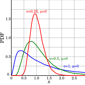
Another idea is that by flattening, we are spreading the data over time. For the log-normal, this would mean varying sigma, since scale and offset are assumed fixed. While a larger sigma lowers the peak, it also pushes the rise further left. This doesn't agree with the "flattening the curve" concept. Lowering the peak should push the peak right, not left.
If you looked at the sigma for each country and estimated percentage infected, there is no real correlation. The only thing that makes sense is that extreme intervention lowers the number of cases. Countries like South Korea and Germany had the most extreme intervention (0.02% and 0.22% infected) and the US with a relatively poor response has the highest (0.92%)
[Updated 5/18/2020 with Scale] It appears scale is correlated to the total number infected, so flattening the curve may be possible.

Data Used: https://covid.ourworldindata.org/data/owid-covid-data.csv
[Updated 6/4/2020. Add to table below date when actual % was reached. Green/Yellow/Red indicate how close the prediction was. This shows how hard it is to predict the future since most of the green dates were before the prediction was made]
Table of % Complete (Assuming Log-normal) Predicted on May 9, 2020
| Country | 50% | 67% | 95% | 99% | 99.9% | 99.99% |
| South Korea | 3/4/2020 3/2-3/3 |
3/8/2020 3/5-3/6 |
3/28/2020 3/19-3/20 |
4/20/2020 3/23-3/24 |
6/4/2020 3/24-3/25 |
8/5/2020 3/24-3/25 |
| France | 4/7/2020 4/6-4/7 |
4/13/2020 4/12-4/13 |
5/9/2020 5/6-5/7 |
5/29/2020 5/12-5/13 |
6/26/2020 5/15-5/16 |
7/27/2020 5/15-5/16 |
| Italy | 4/5/2020 4/4-4/5 |
4/16/2020 4/15-4/16 |
6/2/2020 6/3-6/4 |
7/16/2020 | 9/28/2020 | 12/26/2020 |
| Spain | 4/4/2020 4/1-4/2 |
4/10/2020 4/7-4/8 |
5/4/2020 4/29-4/30 |
5/23/2020 5/8-5/9 |
6/20/2020 5/9-5/10 |
7/21/2020 5/9-5/10 |
| Germany | 4/5/2020 4/4-4/5 |
4/12/2020 4/11-4/12 |
5/10/2020 5/7-5/8 |
6/2/2020 5/16-5/17 |
7/8/2020 5/19-5/20 |
8/17/2020 5/19-5/20 |
| United Kingdom | 5/23/2020 5/26-5/27 |
6/22/2020 | 12/6/2020 | 6/23/2021 | 8/3/2022 | 3/13/2024 |
| United States | 5/19/2020 5/18-5/19 |
6/19/2020 | 12/18/2020 | 8/6/2021 | 12/9/2022 | 12/21/2024 |
Under Reporting
I personally know many people that have claimed to have COVID-like symptoms but were never even tested. The curve fitting model presented above supports those claims, since the "Scale" or estimated total number of cases is far below each countries populations. The highest percentage of estimated cases is United States at around 1%. The remaining 99% are a mix of "not yet infected", "immune" and "infected and not reported". Since the uninfected are susceptible to getting infected, this should result in a potential resurgence. In the case of South Korea and Germany where stricter containment was used, the uninfected is probably a larger portion of the population.Table of Population and Estimated Percentage Infected
| Country | Population | % Infected |
| South Korea | 51M | 0.02% |
| France | 67.0M | 0.21% |
| Germany | 83.1M | 0.22% |
| Italy | 60.6M | 0.41% |
| Spain | 46.7M | 0.48% |
| United Kingdom | 67.1M | 0.79% |
| United States | 328.2M | 0.92% |
Flattening the Curve
There is a lot of talk about "Flattening the Curve". This is the idea that by taking measures, we don't decrease the total number of cases, just spread it out over time. This is misleading on various fronts.Logarithmic Scale
Many sources plot the data with the number of cases on a logarithmic scale. Below are plots of the CDF (Cumulative Distribution Function) with fitted data. The first plot is a linear scale. While the rate of growth is slowing, it still has a way to climb.


Spreading the Curve
[Updated 5/18/2020. Scale is one of the fit parameters and varies by country. It may be possible that scale can be changed by a countries response][Updated 5/18/2020 with Scale] It appears scale is correlated to the total number infected, so flattening the curve may be possible.
| Country | Sigma | Scale | % Infected |
| South Korea | 0.76 | 9.6 | 0.02% |
| France | 0.35 | 41 | 0.21% |
| Italy | 0.55 | 40 | 0.41% |
| Spain | 0.39 | 30 | 0.48% |
| Germany | 0.43 | 33 | 0.22% |
| United Kingdom | 0.82 | 60 | 0.79% |
| United States | 0.88 | 65 | 0.92% |
Reliability of Prediction
The reliability of predictions was evaluated by seeing if a past prediction matches the current numbers. For example, "dt-10", would be a prediction made based on the only data available 10 days ago. This shows that attempting to predict with insufficient data effects the estimation (for example, Russia and Brazil and still rising so their predictions are not reliable). The esimated number of total cases for Italy has been stable for the last 2 weeks (since it is further in the cycle) and has been steadily climbing for the US (since the US is just passing it's peak)
Other Countries
The pandemic is just starting in many of the world's most populous countries: India, Russia, Brazil, Mexico, Indonesia, Bangledesh, Pakistan, Nigeria. Many of these countries are less prepared than the rich European countries that are already passing their peaks. It's too early to tell how this will play out worldwide.Data Used: https://covid.ourworldindata.org/data/owid-covid-data.csv
Prosperity vs. Inequality
Much attention is given to the inequality in income and wealth. Calls to "tax the rich" and raise the minimum wage are efforts to reduce this inequality and appeal to the moral concept of "fairness". However, a more careful look at the data begs for an alternate focus. The goal should not be equality but instead the goal should be to lift people out of poverty.
My hypothesis is that general prosperity is the way to overcome poverty. By general prosperity, I mean a system of organizations, traditions, processes, laws, behaviors that promotes prosperity. Prosperity is therefore the correct measure.

The original model of income distribution has been simplified to two parameters: "scale" and "shape".
In order to decrease poverty, both the shape and scale parameters need to increase.
The following table shows the parameters for the United States and China.
Note: The China data was bi-modal (two peaks) which implies an overlay of two functions.
While the "Equality" parameter for China (0.6) results in greater equality than the U.S. (1.0), it is the larger "Prosperity" parameter for the U.S. (61,160) that results in fewer people in poverty than in China (1,920 and 7,863).
The data used with fitted log-normal distribution are shown in the next figures.


Similar results have been published by Max Roxer and associates at ourworldindata.org. For example, the article "Incomes across the Distribution" [3] includes findings from this research that support my hypothesis:
In "Income Inequality" [4], Global income inequality is plotted at three different times showing that the world has transitioned from most in poverty, to divided by rich and poor, and finally to a richer, more equal world.

References:
My hypothesis is that general prosperity is the way to overcome poverty. By general prosperity, I mean a system of organizations, traditions, processes, laws, behaviors that promotes prosperity. Prosperity is therefore the correct measure.
I. Common Sense Reasoning
You have a choice of living in one of two society:- A very equal society where the gap between the top and bottom of wages is small
- A very prosperous society where even the bottom wage earners have all of the basic necessities.
- In the equal society, the bottom 50% do not have the basic necessities.
- In the prosperous society, the top 1% have 90% of the wealth.
The rational choice is the prosperous society. The problems in the equal society are real resulting in a lack of absolute wealth while in the prosperous society it is more a matter of perception resulting from comparison to the ultra wealthy.
In the next sections, I attempt to prove that this is not just a thought experiment but a reality.
II. Income Distribution
In a previous post [1], I describe the shape of the income distribution for United States. It turns out that this shape applies to other countries. (Note: there are better models for fitting the data [2] but I will stick with the simplicity of my original model).
The original model of income distribution has been simplified to two parameters: "scale" and "shape".
| Parameter | Impact on Equality | Impact on Prosperity |
|---|---|---|
| Shape | Lower values improve equality | Lower values reduce poverty. |
| Scale | Larger values widen the absolute gap, but relative wage gap remains the same | Larger values increase prosperity |
The following table shows the parameters for the United States and China.
| Country | Shape | Scale | Gini Coefficient |
|---|---|---|---|
| United States |
1.0
|
61,160
|
~0.4
|
| Australia | 0.6 |
52,776
|
~0.3 |
| China |
0.6
|
1,920
7,863
|
~0.4
|
Note: The China data was bi-modal (two peaks) which implies an overlay of two functions.
While the "Equality" parameter for China (0.6) results in greater equality than the U.S. (1.0), it is the larger "Prosperity" parameter for the U.S. (61,160) that results in fewer people in poverty than in China (1,920 and 7,863).
The data used with fitted log-normal distribution are shown in the next figures.


III. Additional research
Similar results have been published by Max Roxer and associates at ourworldindata.org. For example, the article "Incomes across the Distribution" [3] includes findings from this research that support my hypothesis:
Australia has also seen an increase in inequality, but ... the incomes of all households increased substantially. This contrast is a good example that makes clear that we cannot rely on aggregate measures – like mean GDP growth and inequality measures – alone. We have to study incomes across the entire distribution to be able to see what is happening.
A last example makes clear that we should not focus on economic inequality alone: Greece has seen substantial reductions in inequality, yet the fall in incomes outweighs this development.
In "Income Inequality" [4], Global income inequality is plotted at three different times showing that the world has transitioned from most in poverty, to divided by rich and poor, and finally to a richer, more equal world.

References:
[1] http://wrauny.blogspot.com/2013/02/why-are-people-poor-and-what-can-we-do.html
[2] Income Distribution in the United States, A Quantitative Study. http://www.roperld.com/economics/IncomeDistribution.htm
[3] Income across the Distribution, https://ourworldindata.org/incomes-across-the-distribution/
[4] Income Inequality https://ourworldindata.org/income-inequality/
[2] Income Distribution in the United States, A Quantitative Study. http://www.roperld.com/economics/IncomeDistribution.htm
[3] Income across the Distribution, https://ourworldindata.org/incomes-across-the-distribution/
[4] Income Inequality https://ourworldindata.org/income-inequality/
Thursday, April 2, 2020
Accepting a Pandemic Mindset
On March 11, 2019, I texted a friend regarding COV-19
This is hard due to the concept "regression towards the mean" that has us conditioned to expect things to eventually improve. A down market recovers. Bad weather passes. I basically have seen this "regression" mindset pervade until something clicks and the person adopts the pandemic mindset.
Meanwhile, I'm thankful that our governor, president and much of the public have adopted the pandemic mindset. I'm watching Brazil carefully because their president still hasn't adopted the mindset.
I believe that this is an opportunity for our culture to evolve in positive ways.
"I think it's overblown and will be mostly over in a month,On March 12, 2019, I texted the same friend with a link to a news story where the governor of California, Gavin Newsom tells people to cancel, postpone events of more than 250 people.
but I've been wrong before trying to predict the future."
"I never thought I'd be proven wrong so quickly"Soon I was working from home, and plotting the daily growth in cases. At first the data was upsetting when I projected the exponential growth forward. Last week I expected 1 million cases by this week and today my prediction proved accurate. I expect 1 million deaths by the end of the month. Although upsetting, I have had to adopt a pandemic mindset.
This is hard due to the concept "regression towards the mean" that has us conditioned to expect things to eventually improve. A down market recovers. Bad weather passes. I basically have seen this "regression" mindset pervade until something clicks and the person adopts the pandemic mindset.
I give everyone a pass that has been or still hasn't yet adopted the pandemic mindset.We all refuse to accept it at first. Everyone has their reason for waiting. But the pandemic will continue to grow exponentially until it can't be denied or ignored. It will continue for weeks, months, maybe years. Eventually, we WILL have "regression towards the mean" where things return to normal. It may be one year or many. Most likely it will be longer than we expect due to our biases.
Meanwhile, I'm thankful that our governor, president and much of the public have adopted the pandemic mindset. I'm watching Brazil carefully because their president still hasn't adopted the mindset.
Coping with a Pandemic Mindset
How do you cope after adopting the pandemic mindset? For me, I'm learning about secular Buddhism. There is suffering in the world. One cause of suffering is us trying to avoid suffering. We can end the suffering. I can't concern myself with worldwide suffering. Even more, I need to be aware of any suffering I am causing myself by my thoughts. Recently I learned about meditation using the method R.A.I.N (Recognize, Accept, Investigate, Non-identify). This is how it works. You sit quietly and try to quiet your mind. When a thought, emotion, feeling distracts you, you recognize it. Then you accept that you are experiencing it and don't try to fight it. Then you investigate. What part of your body is experiencing it? What part of your body released the hormones to drive the emotion? What experience triggered the response? Are your thoughts accurate? Finally, you realize that these things are external to you and not you. Your adrenal gland secreting adrenaline was not commanded by you. The external triggers weren't requested by you. Don't identify with it.If we take the time to look at how we see things, then the way we see things changesI can't control the pandemic. I can only control my thoughts and actions: how I spend my time, how I treat those around me, how I communicate with others. And I can do it in a way that reduces suffering for anyone or thing in my realm of influence.
I believe that this is an opportunity for our culture to evolve in positive ways.
Subscribe to:
Posts (Atom)